June 12, 2024
How to Use a Color Wheel in Home Decor
Very few people suffer from chromatophobia, a fear of color. But many people decorate as if they do, sticking with neutrals for fear of picking hues that clash. If that sounds like you, we have good news: once you understand the relationships among colors, you can select room palettes with confidence. And to understand those relationships, all you need is a color wheel, readily available online and at paint stores, and advice on how to use it. Below are some color wheel tips for decorating your home.
Demystifying the color wheel
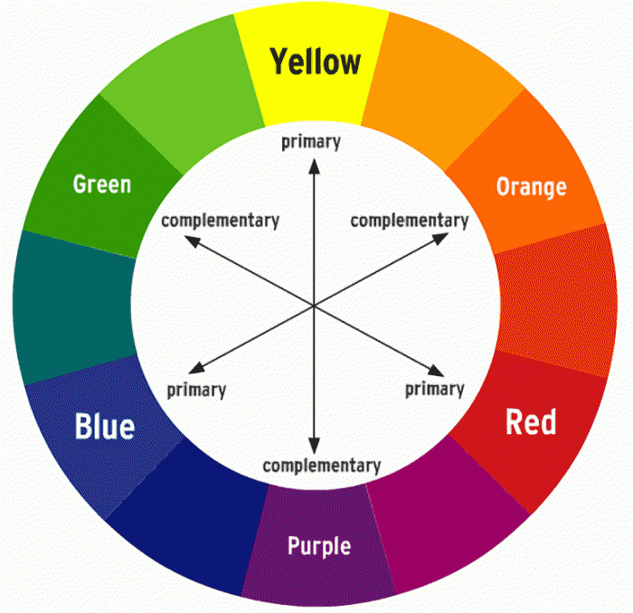
Isaac Newton is credited with devising the first color wheel, in the mid-17th century, to illustrate the relationships among the colors that make up the spectrum of visible light. Over the centuries the wheel has been modified to go beyond the primary and secondary colors to include tertiary colors and to serve practical purposes.
Credit: Bass Museum of Art
For us laypeople, the primary colors are blue, red, and yellow. When two of these colors are mixed together, you get the secondary colors: purple (blue + red), orange (red + yellow), and green (yellow + blue). Tertiary colors are the result of mixing a primary color with one of its secondary colors. Blue + green, for instance, creates blue-green, while blue + purple results in blue-violet.
Every color has a complementary color, the one opposite it on the color wheel. For primary colors, it’s the secondary color in which it is not an element. So the complement of blue is orange, which is red + yellow.
With these basic principles in hand, you can now use the color wheel to determine the type of palette you’d like. The palette isn’t the specific colors but rather the relationship among the colors. Confused? Consider the four most common palettes below:
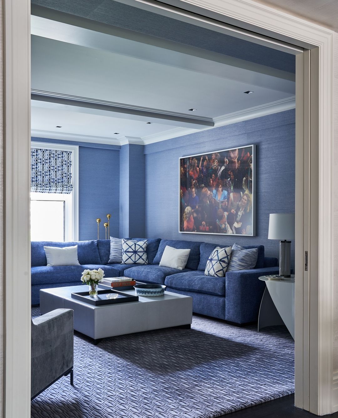
Monochromatic color palette
A monochromatic room is decorated in one color. What keeps this palette from being boring is that you’re using multiple tints and shades of that color. In color theory parlance, tints are a color + white, while shades are a color + black. Those paint swatch cards that present a half-dozen or so tones of a color are an example of a monochromatic palette.
Credit: Design by Eve Robinson; photo by Marco Ricca
Monochromatic color schemes are typically the most soothing, though that depends to some degree on the color. A monochromatic red palette will not be as restful as a blue or green one, unless you opt primarily for tints of red—in other words, pink—or muted shades such as burgundy and maroon.
Analogous color palette
Nearly as serene as a monochromatic palette is an analogous one. This color scheme consists of three hues next to each other on the color wheel—for instance, blue, blue-purple, and purple. Because the hues are closely related, using analogous colors when decorating your home creates a room that is harmonious with a dash of daring.
Credit: Design by Oraanj Interior Design
Triadic color palette
Pick a color, then select two more colors that are equidistant from it on the color wheel. If you start with blue, you could then select red and yellow (separated from blue by three colors), yellow-green and red-purple (separated by two colors), or green and purple (separated by one color). This trio forms a triadic palette. It’s a more diverse, less intuitive take on an analogous palette.

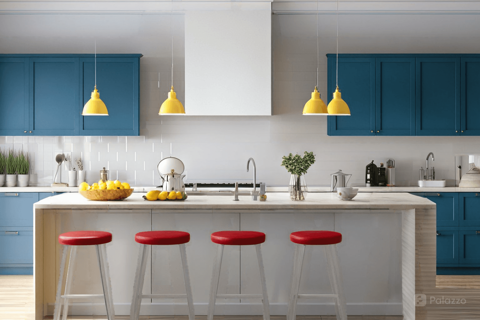
Credit: A bedroom designed using Palazzo
You can play up the energy of triadic color schemes by selecting bolder, more saturated versions of the colors. By the same token, working with softer tints—pink instead of crimson, butter yellow instead of daffodil—results in a quieter room. Or opt for one brighter color among the subtler shades, à la the unexpected red theory, to liven up the space.
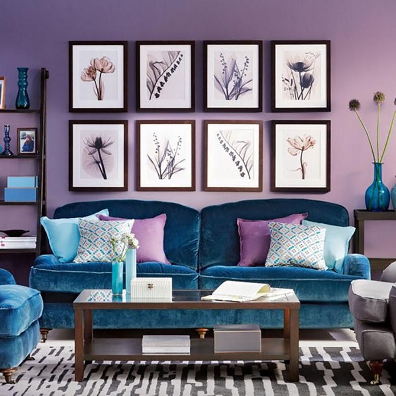
Complementary color palette
As the name suggests, a complementary color scheme relies on two colors opposite each other on the color wheel. When you select colors in their boldest, purest forms, this palette is the liveliest of the four. Even when you choose more-muted colors, it has a certain vigor because the color pairing is unexpected.
Credit: @style_the_hawthorns
What about neutrals?
You’ll note that black, white, and brown are not represented on the color wheel. That’s because they don’t appear on the spectrum of visible light. You can think of true black as the absence of light, and therefore color. Likewise, consider white the essence of pure light, and therefore all the colors of the visible spectrum. As for brown, theoretically if you mix the purest versions of the three primary colors together, you’ll get brown.
What this means is that brown, black, white, and gray (black + white) go with any of the colors on the wheel. That said, just about every real-life version of these neutrals has undertones of other colors. Not convinced? Take samples of several shades of white, and place them on a piece of white printer/typing paper, which is a pretty good approximation of pure white. You’re certain to notice that some of those white samples seem a bit bluer or more buttery than the paper. So if you’re going for, say, an analogous palette of yellow-green, yellow, and yellow-orange, gray or white walls with blue undertones might feel out of place.
Making it work
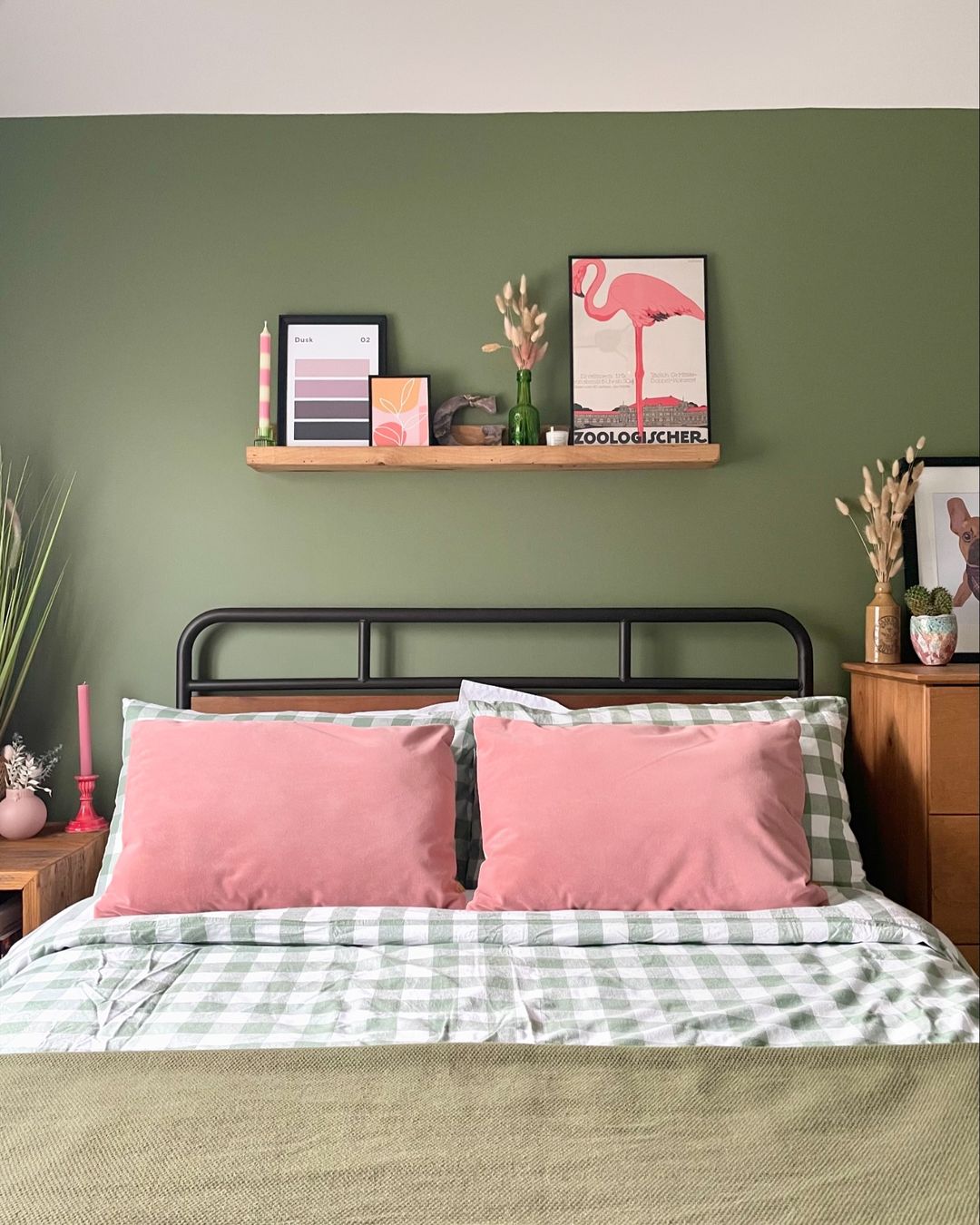
When selecting your palette and the colors that will make up the palette, keep in mind the 60-30-10 color guideline. Your main color—and it can be either a neutral or a hue on the color wheel—should make up about 60% of a room. This is typically walls, rugs, and a major furniture piece such as a sofa or a bed. Your supporting color or neutral should account for roughly 30% of the room: bedding, curtains, smaller furniture. The remaining 10% is your accent color, present in throw pillows, vases, artwork, and the like. This ensures a room looks considered without appearing clinical.
Of course, this formula is just a rule of thumb. If you want two accent colors, your percentage might be more like 55-25-10-10. A room with floral wallpaper, tartan upholstery, or an intricately patterned Persian rug could very easily have more than four colors. Ideally, however, your main color will account for more than half of the room’s palette, and your secondary color close to half as much as the main color.
Credit: A kitchen designed using Palazzo
Experimenting with a color wheel will open your eyes, literally and figuratively, to decorating palettes and combinations you might never have considered before. And an AI-powered design tool like Palazzo can help you determine how to best make those colors work in your home—for instance, should blue-green be the main color of your triadic room and yellow the secondary hue, or vice versa? Simply load a photo of a room into Palazzo, then incorporate the hues of your choice on the room elements of your choice.
Go ahead: color your world!
Sherry Chiger was formerly the head of editorial at One Kings Lane, where she produced a leading interior design blog. She also writes on decor and other topics for numerous other sites and publications.